© Parham Taghioff
PROJECT DETAILS:
KNOW MORE ABOUT THE DESIGNERS:
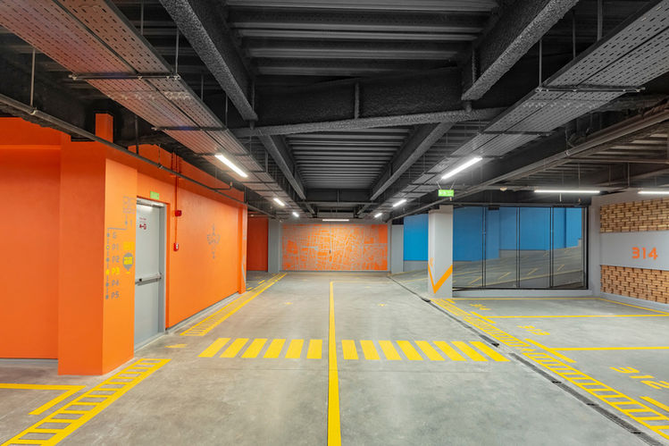
A stack of four cubes, Zomorrod 11 stands firmly at the heart of a traffic junction in Tehran. The design has incorporated the use of geometric brick pattern modules following a strategy by which the exterior façade of the building stretches inside and forms many elements of the interior; from the lowest parking level at -5 through to the top.
The one-way street it overlooks on the south elevation connects two of Tehran's main north-south arteries, therefore the nature of the site's impact on the passer-by is affected by speed and haste. The Architecture has aimed for the drivers and pedestrians to pause, even in passing, and perhaps reminisce through a modern structure with ties to the culture's past. In line with this aspiration, the building is rather still from street level, where all the rushing takes place up to the 3rd floor; which is also the height of the neighbouring buildings. Up to that point, the brick modules are static, which also limits views towards the neighbouring sites. From the third floor to the 6th level, these modules become mobile as it rises higher and distances from the freneticism of the enveloping streets, with views opening up to the mountains and the city scape. Bricks screwed together, framed, and moving on rails along the glazed elevation of the building help the architecture to improvise an impression of the speedy surroundings of the street scape, while also expanding views towards the city from the inside.
The mobile brick panels not only provide an ever-changing image of the building on the outside, but they also enable the user to control the amount of sunlight that flows into the office spaces. Each panel weighs around 1000 kg and, nevertheless, is very easy to push along the rails fitted into the flooring. The mobile modules are designed and engineered to make them as lightweight as possible, using custom made hollow bricks screwed together.
GALLERY:


