© Hei Nong
PROJECT DETAILS:
KNOW MORE ABOUT THE DESIGNERS:
The overall design for T0 Japanese cuisine brand is inspired by five Chinese elements - namely metal, wood, water, fire, and earth - which coincide with their different series of products. Through one entrance, there are two dining zones, and the water and fire concept is respectively adopted in T0 Shibuya Naka Sushi | Charcoal-grilled meat restaurant, an establishment combining OMAKASE sushi and charcoal fire roasts. First, for the fusion of two elements, the designers borrowed the concept of the traditional Japanese architectural wooden frame structure to build up and divide the interior space. Additionally, two circulations for sushi (water) and yakiniku (fire) are arranged in an irregular layout, with different dining zones also distinguished by different floor heights. Two zones are divided by a bidirectional glass wine cabinet in the middle, which can be opened at both sides and enables either zone to be seen from the other side. By means of “creating spaces within a space”, the firm also embedded private dining rooms into the space, where layers of space achieved through different floor heights, a collision of different textured materials, a variety of lighting design, circulations in a variety of orientations, and changing scenery, and movement between open and enclosed spaces all contribute to a fascinating sense of oriental mystery.
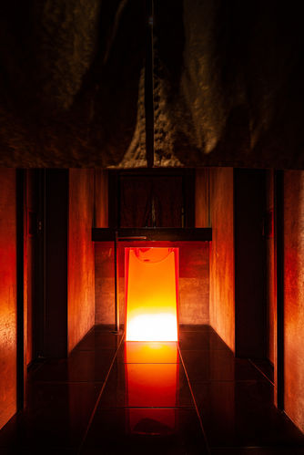
In the fire zone (Yakiniku), the ground is paved with imperial kiln bricks from the exquisite kiln of the Forbidden City and are dyed dark red with pigs blood. The groundwork also includes stone slabs that have been burnt multiple times at extremely high temperatures before being hit and crafted by hand. To create wooden partitions, discarded Douglas fir obtained from old Shanghai buildings was recycled and burnt through deep charcoal burning to create unique scale patterns. Upon a structure inlaid with luminous red-yellowish onyx, exuding a special pattern resembling multiple layers of flames, several other materials and LED light sheets combine to resemble elements of ‘fire’. The water (sushi) zone is mild, like water, in order to retain its essence. The ground is also paved with imperial kiln bricks, but in pure black. In the progress of creating painted art on the walls, golden powder was replaced with silver powder, resembling the the texture of water ripples. The firm selected quarry stone, aged for more than a decade under the scour and corrosive effects of rainwater. To add to the firm's artistic vision of ‘water’, the stone is used for the countertop backdrop, a cross-section of which is as rough as rocks dredged from a lake. Furthermore, additional details include an outdoor logo made of pure bronze and hammered by hand, providing a nod to the spirit of craftsmanship. Two specially designed alabaster pendent lamps, inspired by umbrellas and canoes from the East, are fused with iron as both a structural and decorative function. The storefront surface is fully covered with burnt cedar, free of any reflection, rendering it low-key and mysterious. Only upon opening the gate is the luminous onyx behind it exposed, giving way to an interior space like a Pandora’s box.
Creating all of those elements within the confines of such a small interior was a huge challenge. In that regard, procurement of a variety of special materials and local resources was a priority consideration for the space's interior structure and decoration. Additionally, sustainability was a major consideration, and one that the firm is very passionate about. Finally, the project included traditional craftsmanship by local artisans who the firm really wanted to collaborate with.
GALLERY:


