© Arch-exist Photography
PROJECT DETAILS:
KNOW MORE ABOUT THE DESIGNERS:
To introduce this meeting of culture, aoe created a Cultural Exchange City Reception Center in the city where it all begun. The marriage of the Italian and Sino style was at the heart of the project to illustrate the cultural mix and was adapted to merge the structure and its surrounding.
Chengdu hailed as the land of abundance, has a civilization history of 4,500 years old and a city construction history of 2,300 years old. In the 13th century, Marco Polo came to Chengdu, the Corridor Bridge, the Jinjiang River and the cloth of ancient Sichuan became the most colorful parts of his travelogue. In the 21st century, against the background of the Belt and Road Initiative, the planning of Chengdu Tianfu Cultural and Creative City came into being, and the Sino-Italian Cultural Exchange City Reception Center is an important part of the City, aiming to build a platform for cultural exchange and civilization interchange between the two countries. The project is located about 36 kilometers from the center of Chengdu, planned to cover an area of 17,815 square meters, with a construction area of 2,107 square meters. At the platform of the exhibition hall, the creative group projects on the east side and the natural landscape of Yanqi Wetland are treats for visitors.
The architects hoped to find the intersection of the two in the cultural differences between the East and the West: the overall design concept was taken from the "Ruyi", which has been used in China since ancient times as a gift to foreign ambassadors to signify the conclusion of friendly relations and the peace of the two countries; while the Italian pavilion draws its design inspiration from Italy's most representative piazza, shaping an intimate and pleasantly scaled urban art living room.
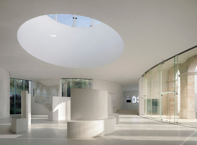
The design elements are extracted from the ancient Roman arches and domes, and the smooth enclosure of multiple circular squares is used to form a rich and versatile use of space to meet the multi-functional requirements of exhibition, meeting, reception, and catering. The use of pure white on all walls gives the building a different three-dimensional light effect in the sunlight, while the large area of glass extends the indoor space to the outside and allows the outdoor scenery to be fully mapped in, becoming a dynamic mural of the four seasons. With the change of wall materials, the designer creates the feeling of space that is both inside and outside, and the pavilion is thus perfectly integrated into the surrounding natural environment.
The harmony between architecture and nature lies in the use of natural resources as well as in the protection of the natural environment. The pavilions on both sides are designed with top lighting so that the light is evenly diffused in the indoor and outdoor spaces. In addition, the introduction of multi-level outdoor greenery and the use of buoyant ventilation devices to channel airflow into the building organically combine the natural elements of light, scenery, and wind, allowing people to perceive and coexist with the surrounding natural environment while they are in the building.
Meanwhile, the building design reveres the existing ecological environment and uses materials and means such as Low-E glass, local wood, and green roofs to reduce building energy consumption and achieve sustainable construction. The exhibition hall serves as an important part for linking and integrating the surrounding ecological forest.
In terms of space planning, the designer has reserved the most flexible space for exhibition and display. The staggered height of the building allows visitors to stand at different heights and view different scenery, creating a "walk in the woods" mood and a unique experience.
The interior of the building is a flowing space shaped by 10 circular walls of different sizes, which are divided into three levels of elevation in accordance with the terrain, rising from the entrance hall to the interior space step by step, with two circular skylights in the entrance hall and the central exhibition hall to guide visitors from the entrance hall to the main exhibition hall. The ceiling is controlled at the same level, and the height of the space is richly varied. Except for the round solid wall, the interior and exterior boundaries are all glass, fully incorporating the outdoor landscape into the interior and the natural landscape as part of the exhibition in the form of framed scenery.
The circular space consists of two spatial forms: indoor and piazza; three outdoor semi-circular piazzas are defined as the entrance fountain piazza, the Italian piazza, and the outdoor theater, each reproducing a typical Italian urban piazza space. The Piazza Italia is surrounded by the ruins of the Roman arches. The three indoor circular spaces are designed as a meeting hall, a multi-functional hall, and a multimedia showroom, which are arranged around the central exhibition hall. By controlling the size of the circular wall openings, the light and darkness of the space are defined, while the meeting room is surrounded by water features and sculptures. The other five outdoor semi-circular walls are surrounded by greenery and mountains, facing nature.
The visitor crosses the gable to the Italian piazza and ascends a curved staircase to the roof garden. There are two circular gardens, one in the east and one in the west, which are complemented by the contrast between natural vegetation and stone.
The Chinese Cultural Hall on the east side is reached by walking down through the cultural corridor or stepping over the Chinese white jade pavement above the water pond. The two paths symbolize the two Silk Roads between East and West, on land and on water.
GALLERY:


