© Francis Champoux
PROJECT DETAILS:
KNOW MORE ABOUT THE DESIGNERS:
Seeking to develop a space conducive to the discovery of Japanese cuisine and the izakaya atmosphere, Chef Frédéric Dufort and his team entrusted the design of the spaces for their new culinary project to Cléo Katcho Design Architectural.
A new Japanese pub concept
Having immersed themselves in the history of izakayas - small Japanese pubs where small plate sharing is typical - the design team opted for a conceptual approach that would juxtapose the modernity of the place with its roots. This dichotomy between the izakayas' long culture of tradition and the restaurant's modernity set the tone for a series of design interventions marked by contrasts.
The concept was strongly inspired by the post-war alleyways where the izakayas were established, and by their dark and raw side. This influence is particularly noticeable in the material choices and lighting design. The design was crafted to contrast both soft and hard, warm and cold, rudimentary and sophisticated in order to create the immersive and sensory experience the team set out to achieve. The numerous lighting interventions in this project have largely contributed to the achievement of this objective.
A plurality of experiences within the same space
The space, which already had some architectural components that the team had to work with, was planned so that there would be distinct sections. By using different types of lighting and seating, the team was able to create several spatial transitions within a large open space.
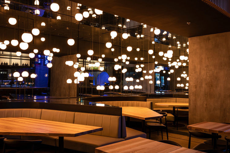
The first section, identifiable by a series of alcoves, focuses on games, represented by the blue neon symbols on the wall and influential in Japanese culture. The front section is reminiscent of an alley, with neon signs visible from the outside. The bar area, which is central to the design, is characterized by a lantern-like structure and is a tribute to the sake protocol. In addition to these areas, a VIP section differentiates itself through the distinctive visual experience that it offers to the client, formed by the infinite reflection of multiple suspended lights on the mirrored walls and ceiling. To complete the overall experience, particular attention was also paid to the washrooms, with each possessing its own decor and soundtrack.
An atmosphere propelled by the play of light
The play of light and the color temperatures of the light sources used in the various lighting fixtures selected contribute to the conviviality of the place, while bringing out the gloomy side of the alley. At the heart of the restaurant is the lantern which, when lit, takes shape and becomes the focal point. Warm light emanating from the bar contrasts with cooler color temperatures used in the alcove section and the front of the restaurant, illuminated by a series of neon signs.
The kitchen and bar, central to the izakaya
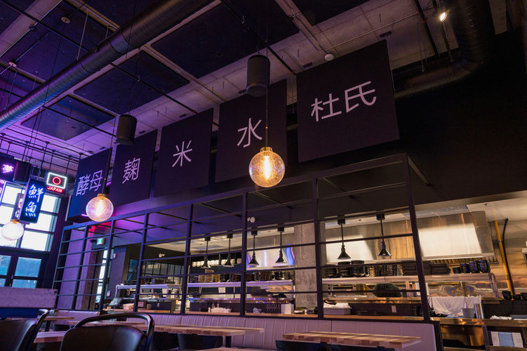
The division of the space was done to allow for a view of the open kitchen, as well as a focus on the central architectural element - the bar. The connection to the kitchen was an important aspect to consider in the design and the sensory experience: the sights, sounds, and smells emanating from the kitchen all contribute to recreating the closeness typically associated with the experience of traditional izakayas.
Walls that speak
The wall art that characterizes the space is representative of this history and tradition surrounding the sake protocol that defines classic izakayas. The design team wanted to tell the specific story of Iru, a non-traditional izakaya, but one that draws its inspiration from tradition.
GALLERY:


